
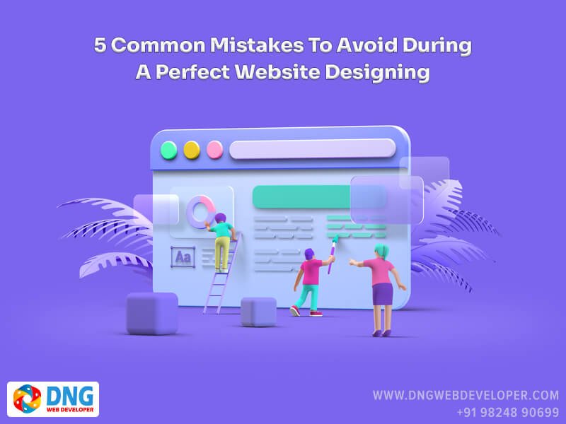
Website Designing – How to design a website for business:
This is no longer an option, but rather an absolute necessity for any business that wants to attract and retain new customers. It’s no secret that a poorly designed website can cause your business to lose customers and ultimately money.
As a result, many small-business owners opt for DIY solutions and low-cost alternatives instead of hiring a professional web design company. Their own ideas about what constitutes a good website designing can get in the way of their success for many enterprise companies.
Errors made on your website designing can have long-term effects on the health of your company. To find out what the most common problems are on business websites today, we asked a group of entrepreneurs, website designing and user experience (UX) experts.
Is your site guilty of any of these errors? You can fix your website design mistakes today if you know what to do.
1. Jumping right into the design software development programme

You can easily get ahead of yourself as a beginner by designing the interface of a website designing before you’re ready. In order to achieve the best results, we recommend starting off by creating a foundation on which to build. Your design will be better informed as a result of this.
Users flows, which outline key interactions and paths taken by users to satisfy each user storey, and most importantly, wireframes, should be available at this stage. You can iterate on a rough design using paper and pencil.
2. Grids, guidelines, and columns are often overlooked.
When it comes to grids and guides, junior website designing tend to overlook their importance. When it comes to vertically segmenting content and aligning these blocks of content, columns come in handy. They’re flexible and can be customised to the user’s liking.
Gutter position in website designing:

Containment can breathe easier if gutters are placed on either side of a column. When a design is handed over to a developer, they can see the columns, which provide context for the space used in between sections of content.
3. Absence of a visual hierarchy

Inexperienced web designers often overlook the importance of visual hierarchy when creating their first website. The site’s visual hierarchy should guide users to their destination. Making elements larger or more prominent on the web page can help achieve this. Depending on your intent, white space can also increase the visibility of a hierarchy by separating out blocks of content.
Businesses are frequently asked by clients to move content closer together, but you need to use your expertise to advise on the best way to achieve the desired goal of moving the content together.
4. Not taking accessibility into consideration
An often-overlooked but vital aspect of website designing is its accessibility. If a website designing isn’t built to be accessible, customers with visual or auditory impairments will be unable to use it. A wide range of issues are covered under the umbrella of accessibility, some of which are simple to understand and implement, while others are more complex. It’s much easier to incorporate accessible design into your site from the beginning than to try to improve it later.
It’s much easier to incorporate accessible design into your site from the beginning than to try to improve it later.
Why color contrast is important in website:

Despite the fact that colour contrast is a major deterrent for many users, it is relatively simple to fix. It is estimated that approximately 300 million people are colour blind. Especially if your site contains multiple colours that do not pass the contrast test, this can have a major impact. Also, if colour is used to denote status, it affects things like iconography. Use Google to search for “colour contrast test” if you want to run it.
5. Regarding mobile experience with disdain
Mobile website:
Everyday life has become more and more dependent on our mobile devices. Website designing should be designed with mobile devices in mind to ensure that they are mobile-friendly and easy to use. Mobile devices account for 57 percent of all web traffic, a number that has undoubtedly increased since then.
It will be easier for users to interact with your website designing. If you consider their mobile experience. If you want to reduce scrolling time, you’ll need less padding between elements and smaller text to allow for full-width content, rather than trying to cram large text onto the screen. If a site isn’t mobile-friendly, there shouldn’t be an excuse.
Beginners often make the same mistakes when it comes to a website designing. However, these are a great place to start. It’s important to consider who will be visiting the website, what device they will be using, and what they want to accomplish. Helix Webi is a Surat based e-commerce website designing company Surat offering best deals on e-commerce web development. We are the best online shopping website development company in India offering e-commerce website development services at affordable rates to our clients.